

From Interest to Investment
IPO Club is a private investment platform designed for accredited investors who want access to late‑stage technology startups and secondary opportunities
Client
IPO-CLUB
Responsibilities
Idation, Wireframing, User Research, Design, Prototyping
Team
Manager, two Business Analysts, UX Researcher and Brand Market
Duration
Jun 2025 - Sep 2025
Impact From the Project

Developed and designed a customer onboarding workflow increasing new sign-ups by 150% within one week of rollout

Redesigned the company website and user experience, reducing bounce rate by 2%, and increasing unique visitors count by 839%

Leveraging stakeholder feedback& B2B investor materials, redesigned the pitch decks resulting in the acquisition of 5 new investors
Problem Statement
“How do we increase the website’s presence when sign‑ups were under 1%, visibility was low, trust signals were weak, and the user journey failed to convert?
Product Redesign
Persona

Demographics
Age Mid 50s
Location Coastal (SF, NY)
Financial Profile US Accredited investor, net worth >$1M

Pain Points
Unclear onboarding discourages signups
Investor decks lack narrative clarity
Requires trust in the fund’s history before moving forward

Goals
Diversify portfolio with late-stage tech and resilience sectors
Access trustworthy investment opportunities
Balance liquidity with long-term potential

Design Implications
Redesign for high-net-worth investors
Onboarding streamlined to cut friction and respect time
Refine pitch deck with clear visuals & story
Comparative Evaluation

Augment Market
Audience: Accredited investors ($10K min)
Strengths: Streamlined access to late-stage shares
Limitations: High fees, limited liquidity
IPO Opportunity: Lower entry barrier
OptoInvest
Audience: RIA, family offices
Strengths: Custom private market programs
Limitations: Advisor-centric, not consumer- facing
IPO Opportunity: Tailor for direct investors

EquityZen
Audience: Emerging retail investors
Strengths: Fast transactions, low minimums
Limitations: Early stage, limited brand recognition
IPO Opportunity: Balance accessibility pitch
Redesign and Revamping
Before
After
Footer


Redesigned the footer to improve usability and engagement by introducing modern icons, segmenting content, replacing the newsletter with a clear call‑to‑action button, and reinforcing the site’s branding through consistent visual language.
Company Page


Revamped the News & Articles section of the home page to improve readability and engagement by showcasing fewer articles with richer details and adding a clear button to view more.
News and Articles

Restructuring the company page prioritized readability by refining content layout, removing the search bar, and leveraging scroll features to simplify navigation for users.
Onboarding Experience
Inspiration

Speed as strategy
The entire flow is designed to be quick
Turn traffic into conversions by minimizing steps and decision fatigue
Single transaction clarity
By centering onboarding around one clear buy‑or‑sell action
Augment reduces complexity and gets users into meaningful engagement fast
Compliance without friction
Augment integrates the accredited investor check seamlessly
Regulatory requirements can be handled without derailing the user journey

Benchmark relevance
These qualities directly map to IPO Club’s challenge
Balancing compliance, clarity, and conversion
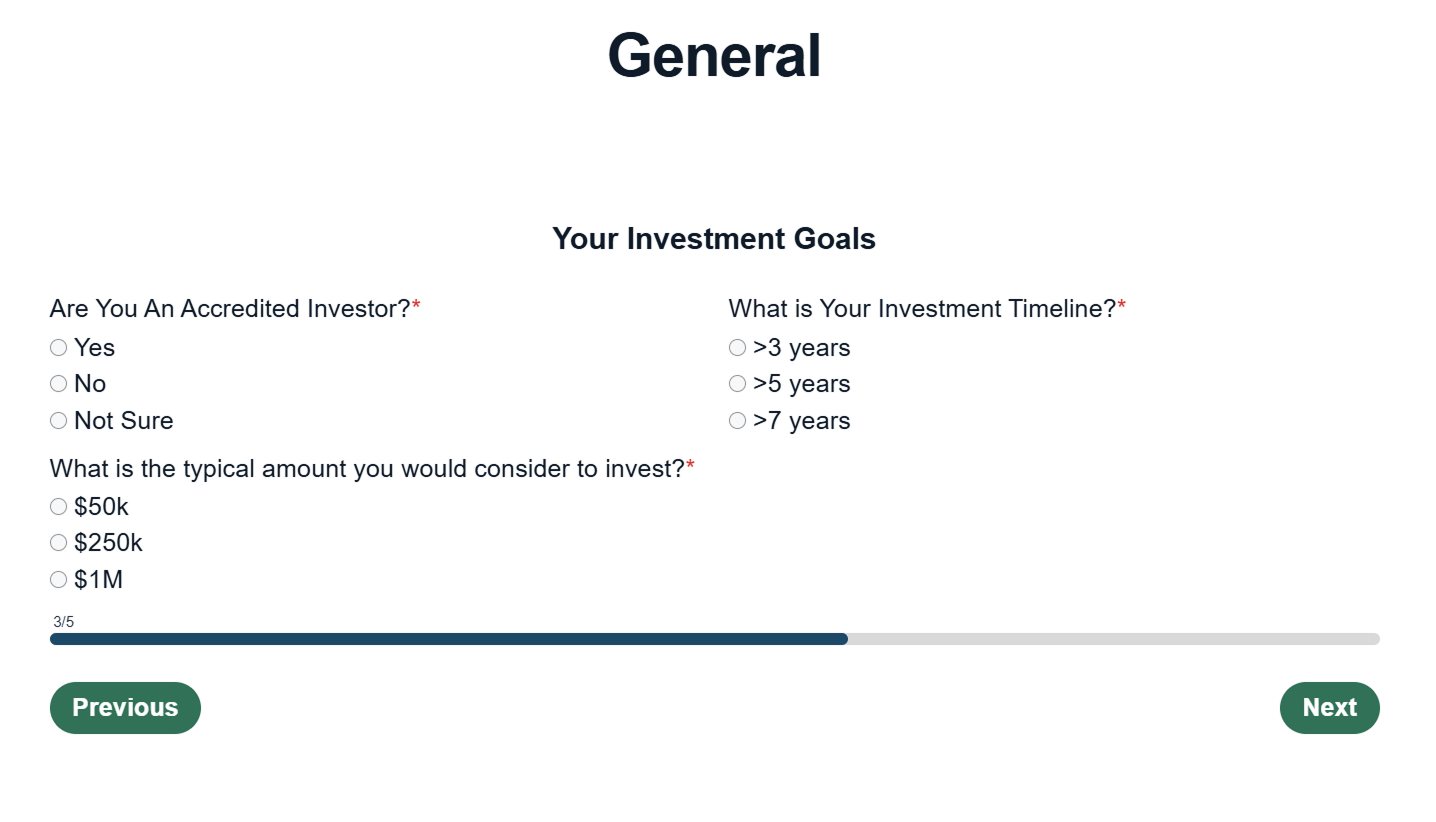
Onboarding


The parts that stood out to me were the progress bar, the top to bottom information flow with no side navigation, and the content was short and easy to read.
Rough Sketch


We utilized Figma to sketch how the outline could look, aiming to stand out by incorporating colors, using pill‑style selections, and designing the flow left‑to‑right.
Challenges

Rigid Data Tracking
Keywords in HubSpot were different from what we were used to when onboarding users.

Default branding
We could not incorporate IPO Club’s colors as much as we had planned in the platform, we had to rely on our website instead.

Design Limitations
HubSpot’s design was restrictive and leaned toward structured data workflows, which limited layout flexibility and customization.
Execution


These panels kick off onboarding with a clear progress bar and top‑to‑bottom layout. We adapted to HubSpot’s format while guiding users through identity and fund type selection. Brand colors were limited, but hierarchy and tone stayed consistent.

These panels capture experience and goals while integrating the accredited investor check. We adjusted for HubSpot’s rigid tracking terms and preserved clarity. The flow balances compliance with personalization to support conversions.
Capital Strategy
Challenge

Template Misalignment
Two business analysts built the initial pitch deck using a dark‑UI template inspired by 8VC’s investing platform, which emphasized flashy interactions and glowing effects.
The style clashed with IPO Club’s brand identity and diluted the professionalism of the presentation.

Visual Inconsistency
The analysts did not consult me on branding, typography, or color palette.
As a result, the slides were inconsistent in tone and design, weakening narrative cohesion and making the pitch feel fragmented.
Brand Alignment Elements

Typography
Arial simplifies readability for the target persona.
Consistency across all slides by standardizing hierarchy.
Reinforce a neutral tone aligned with IPO-CLUB identity.
Logo Refinment

Adjusted the logo by adding a white line for clarity across all slides.

Color Palette
Deep Navy (#101925)
Green (#11684C)
Light Neutral (#E1DFD7)
Blue Accent (569ED8)
Black (#000000)
Clarifying the Capital Narrative
Before
After
Fund I - Exits


Reformatted the original content to ensure presentation clarity. The initial version included warped characters and overlapping text, which compromised readability and visual hierarchy. The layout and typography skimmable and investor‑ready.
Fund II - Four Key Features


Apply the exact color palette and typography from IPO Club’s website to ensure brand consistency. This slide reflects the company’s established identity, reinforcing cohesion between the online presence and investor presentation.
Reflection

Solo User Experience Researcher
Designed a product solo for the first time, a role that deepened my understanding of product management.

What We Missed
Despite strong results, we did not have the opportunity to produce videos that explained the platform, an area I was excited to explore.

Interest in Venture Capital
My interest in venture capital reflects how investing can drive innovation and empower entrepreneurs.

Business Analytics
The role became the catalyst for my dual degree pursuit, the stakeholder collaboration added energy and fun to the process.