
Enhancing Movement for Students
We designed a prototype for the MBus system to reduce stress and deliver a seamless, schedule-aware transit experience for Univeristy of Michigan (UofM) students
Responsibilities
Idation, Wireframing, User Research, Design, Prototyping
Duration
Sept 2024 - Dec 2024
Team
UofM Faculty, 4 UXRD
Client
University of Michigan
Impact From the Project

Students found the features from the prototype useful including the routes

Called out the flaws of the system, such as no feedback options

The prototype was met with acclaim from the faculty and class
Problem Statement
How do we reduce transportation stress for University of Michigan students by integrating class schedules, enabling real-time bus tracking, and providing meaningful feedback tools to improve daily commutes?
Research & Insights
Interviews

Participants
All the participants are current or former students from UofM living in Ann Arbor. Some of the students are under and graduates from both in and out of state

Equipment
We conducted virtual interviews using Zoom and recorded insights with collaborative tools like Google Docs and Miro to streamline analysis and synthesis
Interview Analysis

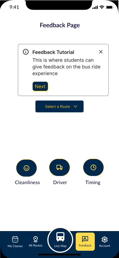
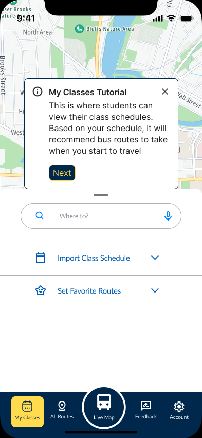
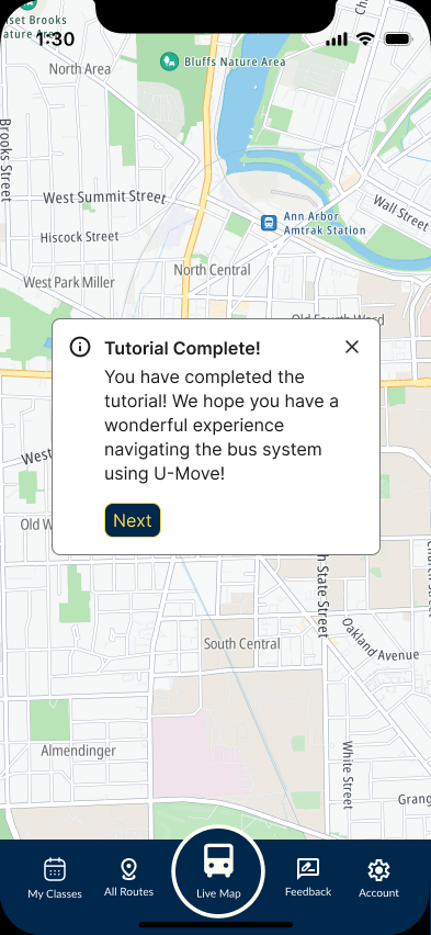
We structured the prototype to include a tutorial page, making onboarding smoother and helping our design stand out through thoughtful user guidance

Improve Connection
Improve the connection by integrateging bus scheduless with the bus system

Access to Information
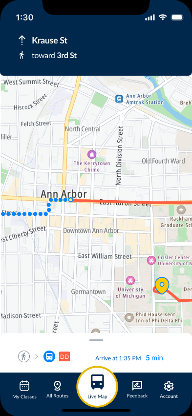
Allow them access to accurate bus information to reduce wait times and improve punctuality

Provide Feedback
Providing opportunities to give feedback in order to optimize daily commutes?
Persona

We developed user personas to represent key segments of our target audience, each grounded in distinct motivations, behaviors, and pain points.
These personas helped us empathize with users and prioritize design decisions that support intuitive onboarding, emotional resonance, and long-term engagement.
Information Architecture

We structured the prototype to include a tutorial page, making onboarding smoother and helping our design stand out through thoughtful user guidance.
Design Strategy and Execution
Lo-Fi Wireframe

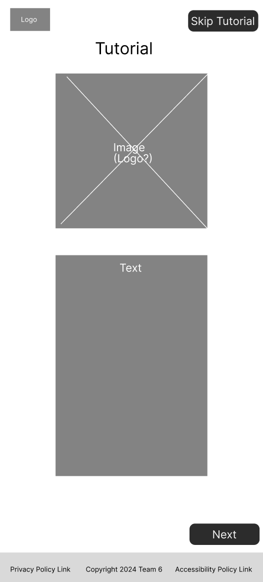
To differentiate our app prototype, we incorporated tutorial guidelines and user feedback features to enhance usability and engagement
Mid-Fi Wireframe


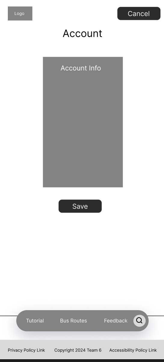
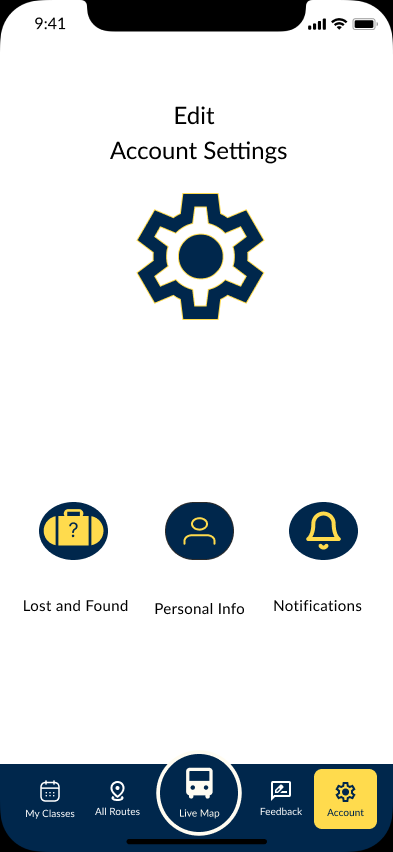
We chose to keep the account and feedback pages simple and user-friendly to avoid unnecessary complexity, a lot of the students do not want a complicated system to learn on top of school
Hi-Fi Wireframe

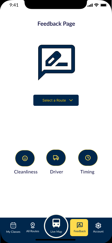


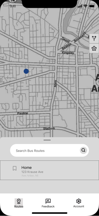
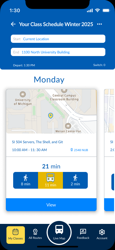
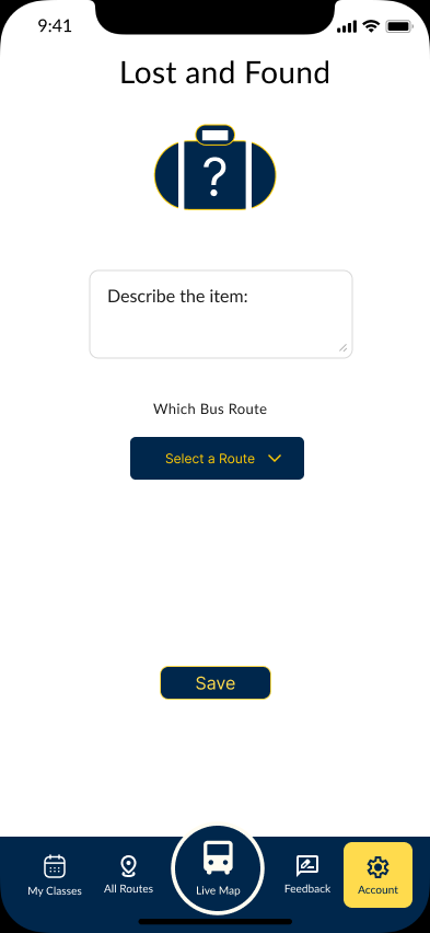
We prioritized integrating the route list, streamlining the feedback page, and applying Michigan colors to intentionally reinforce school spirit through design
Testing & Iteration
Tutorial
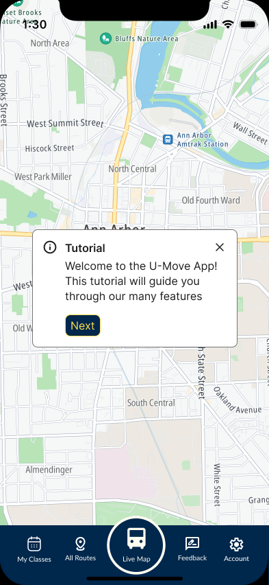
In our user testing sessions, participants consistently indicated that the tutorial lacked sufficient clarity, underscoring the importance of providing more explicit step‑by‑step instructions to reduce confusion and improve overall usability
Route Setup
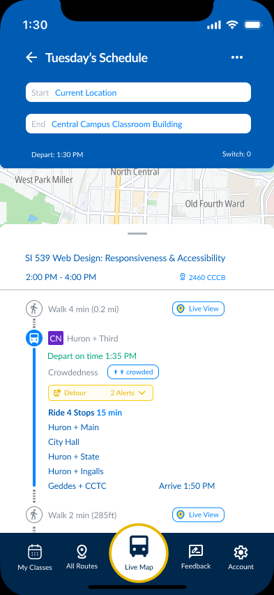

Feedback from participants revealed that the route setup process lacked sufficient clarity, emphasizing the need for more explicit step‑by‑step guidance to reduce confusion and improve navigation
Feedback & Account System
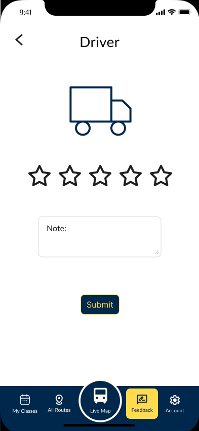
Participant feedback highlighted that the account system needed stronger personalization features, underscoring the importance of tailoring account settings and feedback mechanisms to enhance engagement and reduce friction
Impact
Positive

Accessibility
Our app makes it easier for all students to access and understand the campus bus system

Pollution
By encouraging more students to take the bus, our app can help reduce traffic and lower emissions

Navigation
The app provides real-time route and schedule information, helping students navigate campus efficiently
Potential Negative

System Abuse
Unwarranted negative feedback could lower a route’s score and affect driver morale

Emotional
Receiving harsh comments may upset drivers, even when the criticism isn’t justified

Driver Impact
Some users might misuse the feedback feature to leave unfair or excessive criticism
My Key Takeaways

User Empathy Matters
As my first project, I learned how important it is to design with clarity and student needs in mind, simpliciy can drive trust and adoption

Feedback & Guardrails
I discovered that open feedback channels need thoughtful moderation to prevent misuse and protect team morale

Small Changes, Big Impact
I saw firsthand how intuitive design can shift behavior, streamlining navigation encouraged bus usage and helped reduce pollution